
💡 Whether you have questions, ideas, or are simply curious about how we can work together, I’m just a message away.
Is it just there to make you look professional or trustworthy?
Most businesses have a website.. but, are we all truly aware of its purpose?
Because the reality is that a fancy design alone won’t make you money. In fact, it can cost you money if it distracts visitors from what they actually came for..
Not only do they not make money, they cost you money. Not only because you’re paying for them, but because they’re distracting visitors from what they’re looking for on your website, which means a lower conversion rate.
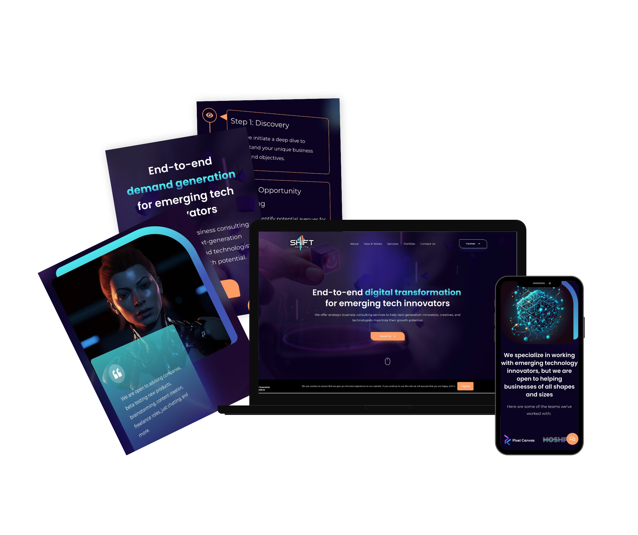
Don’t be just another ‘me-too’—cut through the noise with a compelling message.
A design optimized for specific metrics that prioritize conversions over aesthetics (good looking website).
How do we optimize this? Simple, we use real data.
Where does that data come from? Also simple:
– Google Analytics – how much time visitors spend on your site
– Google search console – what search queries bring traffic, what pages rank, what’s missing
– HotJar – heatmaps & session recordings (where users click, scroll, and drop off)
– Ahrefs / SEMrush – SEO insights, keyword opportunities, and backlink analysis
People always care more about themselves and their problems than anything else.
That’s why your website needs to focus on making visitors feel like their issues are being solved.
Here’s the process I’ve crafted from studying the best and biggest players in the industry(Shopify, Spotify, Donkey republic, etc.).
With over 250 websites analyzed and built, I’ve combined their top secrets with my 8 years of experience to create the ultimate page architecture for your success.
Highlight your capability to provide an end-to-end solution in a single sentence.
A trustworthy website reassures your visitors that your data is safe and that your offerings are reliable.
By enhancing credibility, you reduce friction in the user journey, leading to higher conversion rates.
Highlighting the problem/pain points will make visitors identify with them and spend more time reading your content.
Otherwise, no one will be interested in your website, which means no one will buy your solution.
The key is that you can only talk about the benefits after establishing your credibility and introducing the problem.
The more concise you can be – the better, as people’s attention spans have never been shorter.
You need to give visitors a reason to stay on your site and keep thinking about you.
Providing free value is crucial (offer a free demo, webinars, insights, or other engaging content).
Here’s the deal: you should connect with me if you want to work with someone who knows what they’re doing and won’t waste your time with unrealistic promises about your options.
I’m here to do the job and deliver best-in-class service. So I’ll only take your project if I believe we can achieve great results.

















Made by 
All Rights Reserved @ 2024

💡 Whether you have questions, ideas, or are simply curious about how we can work together, I’m just a message away.